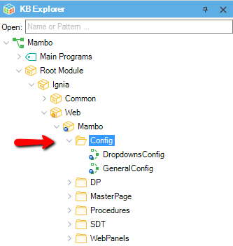
In Ignia, to facilitate the work with Web Templates for each template, a Config folder is created with procedures from which users can configure most of the functions of a template. To modify the fundamental functions of the Mambo template, go to the Config folder located inside the Mambo module .
The modifications related to the styles of the templates and the colors can be made from the theme of each template and its related color palettes.
General setting
The General settings of the Template are found in the GeneralConfig procedure.
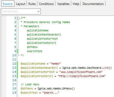
In this procedure you can configure:
- Name of the application (applicationName): text that will be displayed in the top bar on the right side of the logo.
- Link of the application name (applicationDashboardUrl): link to which you want to redirect the application if the user clicks on the name of the application.
- Footer text (applicationFooterText): text that is displayed in the footer of the template.
- Footer link ( applicationFooterUrl): link to which you want to redirect the application if the user clicks on the footer text.
- Menu data load: The Data Provider is assigned to the SDTMenu with the elements that you want to show in the menu.
- Placeholder of the menu search bar (searchText): text that is displayed in the search bar of the default menu.
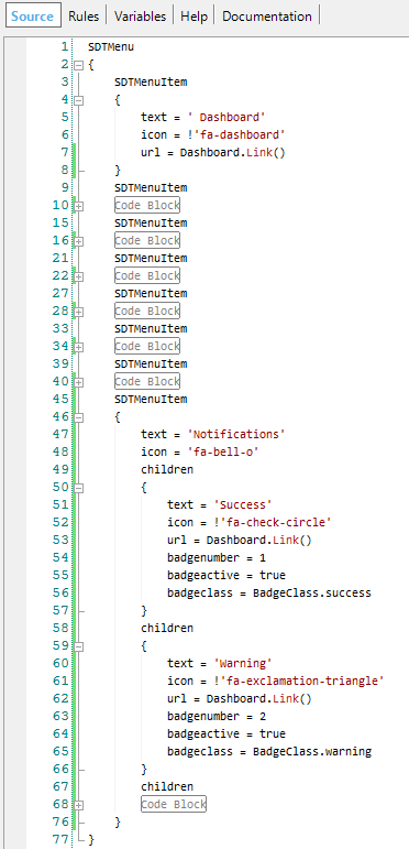
Mambo Menu
In the GeneralConfig procedure you can configure the data loading of the Mambo Menu. By default a Data Provider (DP) is assigned to the SDTMenu with the menu elements, if the user wishes, he can update the DP with its elements or fill the SDTMenu directly with its own elements. The default DP that contains the menu items is DPMenu.
The menu can contain n-elements and n-levels always respecting the structure of the SDTMenu. A menu item can have the following fields:
- text: text to display for that menu item.
- url: link to which the site is redirected when clicking on the element.
- icon: icon that is displayed on the left side of the text. You can use all the available fonts in Font Awesome as an icon, for this the user only needs to add the icon name he wants to use to the element. (http://fontawesome.io/icons/)
- target: allows specifying where the link of the element is opened, the possible values are in the TargetLink Domain.
- badgenumber: a numeric value if you want to show a notification in the menu item
- badgeactive: if the notification is active or not.
- badgeclass: class for notification, possible values are in the BadgeClass Domain, used to handle the background color of the notification.
Dropdowns Configuration
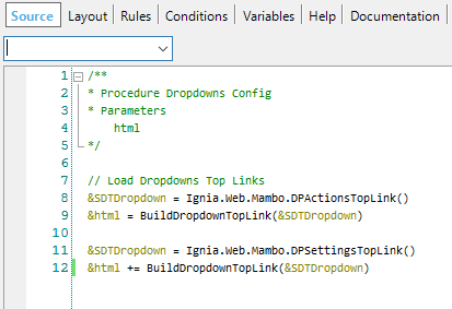
Mambo incorporates dropdowns in its upper bar that can be configured from the DropdownsConfig procedure.
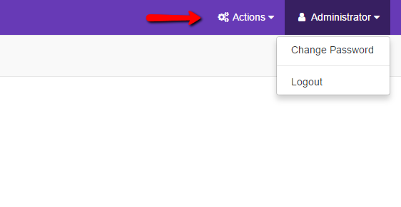
By default the template comes with two dropdowns, but you can configure as many as the user needs.
- Fonts available in Font Awesome, for this the user must only add to the element the icon name that wishes to use. (http://fontawesome.io/icons/)
- badgenumber: numeric value if you want to show a notification in the menu item.
- badgeactive: if the notification is active or not.
- badgeclass: class for notification, possible values are in the BadgeClass Domain, used to handle the background color of the notification.
- isDivider: allows you to configure that an element is a driver type, which draws a line to separate the elements of the dropdown. To add a new dropdown you must create a new collection of elements for the SDTDropdown and call the procedure BuildDropdownTopLink and call the procedure.
- The dropdowns that come by default get their Data from DPActionsTopLink and DPSettingsTopLink Data Providers which can serve as an example for the user.
The fields allowed for a dropdown are the following:
- text: text to show for that element.
- url: link to which the site is redirected when clicking on the element.
- icon: icon that is displayed on the left side of the text.