Starting a new management system?
Do you want to give a new look to your old system?
AdminLTE is your Design System.
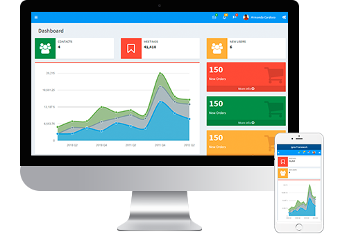
AdminLTE is the most used Design System on Ignia Framework.
The Ignia Framework developer site (this one) is developed using AdminLTE.
It is an excellent framework for the development of management applications, 100% responsive y compatible with existing WW patterns.
General Settings
To modify the fundamental functions of the AdminLTE Design System you must go to the Config folder that is inside the AdminLTE module.
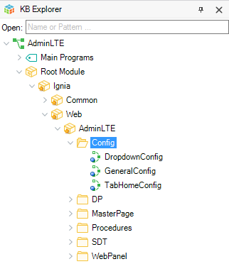
The general settings of the Design System are found in the general GeneralConfig procedure.
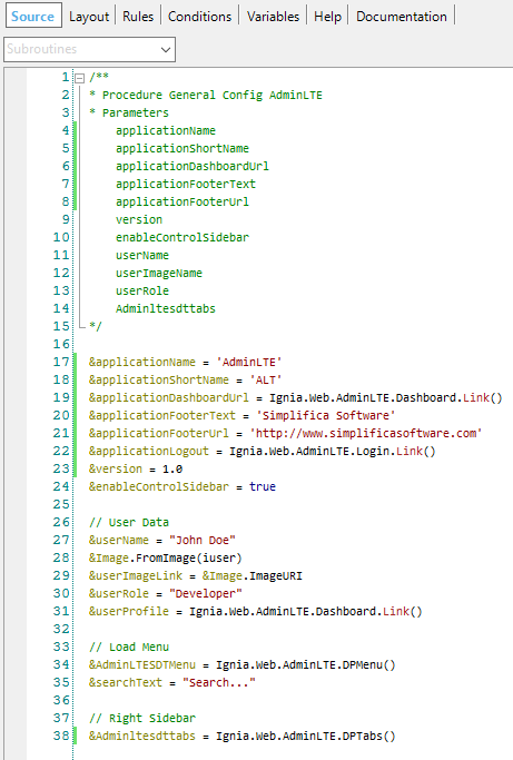
In this procedure you can configure:
- Name of the application (applicationName): text that will be displayed in the top bar on the menu.
- Abbreviated name of the application (applicationShortName): text that will be displayed in the top bar on the on the menu is collapsed.
- Link of the application name (applicationDashboardUrl): link to which you want to redirect the application if the user clicks on the name of the application.
- Footer text (applicationFooterText): text that is displayed in the footer of the template.
- Footer link (applicationFooterUrl): link to which you want to redirect the application if the user clicks on the footer text.
- Version (version): Version of the application to show in the footer.
- Other configurations related to the Menu, Authenticated use Data, Dropdowns Configurations and the Notifications Bar that are explained separately below.
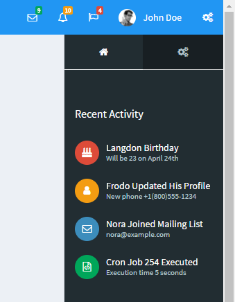
Configuration Authenticated User Data
In AdminLTE, two sections are included where the main data of the user who is authenticated in the user who is authenticated in the application can be displayed.
The first one is shown at the top of the menu:
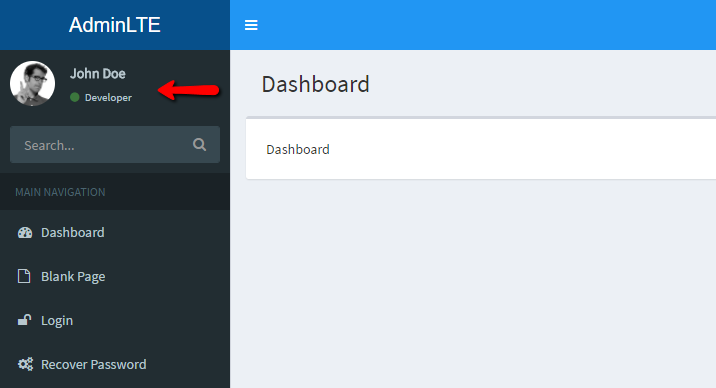
The second one is shown to the right of the top bar:
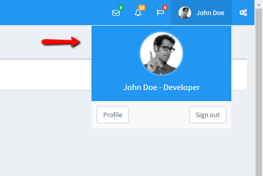
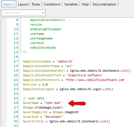
From the GeneralConfig procedure you can configure:
- Username (userName): the name of the authenticated user.
- Role (userRole): Role of the user.
- Profile (userProfile): the url of the user's profile.
- Logout url (applicationLogout): the url to call whwn you want to exit the application.
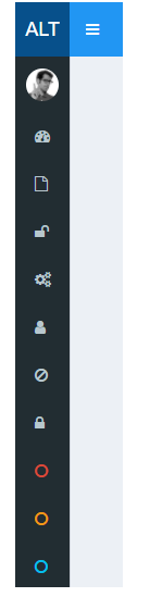
AdminLTE menu
In the GeneralConfig procedure you can configure the loading of the data in the AdminLTE menu. By default, a Data Provider (DP) is assigned to the SDTMenu with the menu items. If you wish, the user can update the DP with its elements or fill the SDTMenu directly with it own elements. The default DP that contains the menu items is DPMenu.
The menu can contain n-elements and n-levels always respecting the structure of the SDTMenu. A menu item can have the following fields:
- text: text to display for that menu item.
- url: link to which the site is redirected when clicking on the element.
- icon: icon that is displayed on the left side of the text. You can use all the available fonts in Font Awesome as an icon, for this the user only needs to add the icon name he wants to use to the element. (http://fontawesome.io/icons/)
- target: allows specifying where the link of the element is opened, the possible values are in the TargetLink domain.
- typeltem: specifies the type of the element, the possible values are in the AdminLTETypeItemMenu domain.
Dropdowns configuration
In the AdminLTE dropdowns are incorporated in the top bar, the menu has three styles dropdowns:
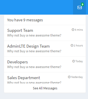
Dropdowns can be configured from the DropdownConfig procedure found in the folder Config folder of the AdminLTE module.
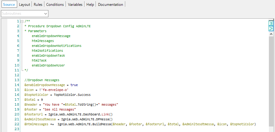
For each dropdown you can configure:
- State (enableDropdownMessage, enableDropdownNotifications, enableDropdownTask): whether you want it to be displayed or not.
- Icon (icon): the dropdown icon, you can use any of the icons available in Font Awesome (http://fontawesome.io/icons/).
- Badge Color (topNotiColor): notification badge color, available colors are in the TopNotiColor domain.
- Total items (total): the value of the number of notifications.
- Header text (header): the header text of the notifications component.
- Footer text (footer): the footer text of the notifications component.
- Url Footer (footerUrl): the url to which it is redirected when clicking on the footer text.
- Messages to show (Adminltesdtmessa, Adminltesdtnoti, Adminltesdttasks): the messages and the structure of the elements to be displayed depend on each type of dropdown, each one has a specific SDT, in the procedure a Data Provider is assigned for each SDT with the messages, if the wishes, he can fill in the SDT data of the database of his application respecting the structure of the SDT.
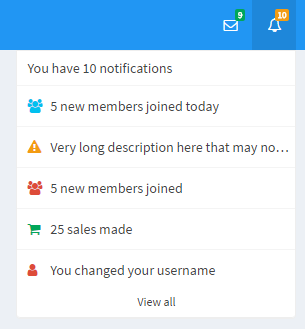
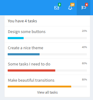
Notification bar
The Notification Bar allows you to display a vertical column with several tabs and several types of notifications on the right side.
The Notification Bar that can be configured from the GeneralConfig procedure, can be enabled or disabled and assigned thel Data Provider with the data of the tabs.
For the tabs you can configure two notifications styles currently.
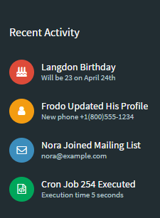
- Notifications of recent activities
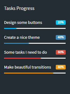
- Task progress notifications
In the TabHomeConfig procedure you can configure Tab Home notifications.