Control Description
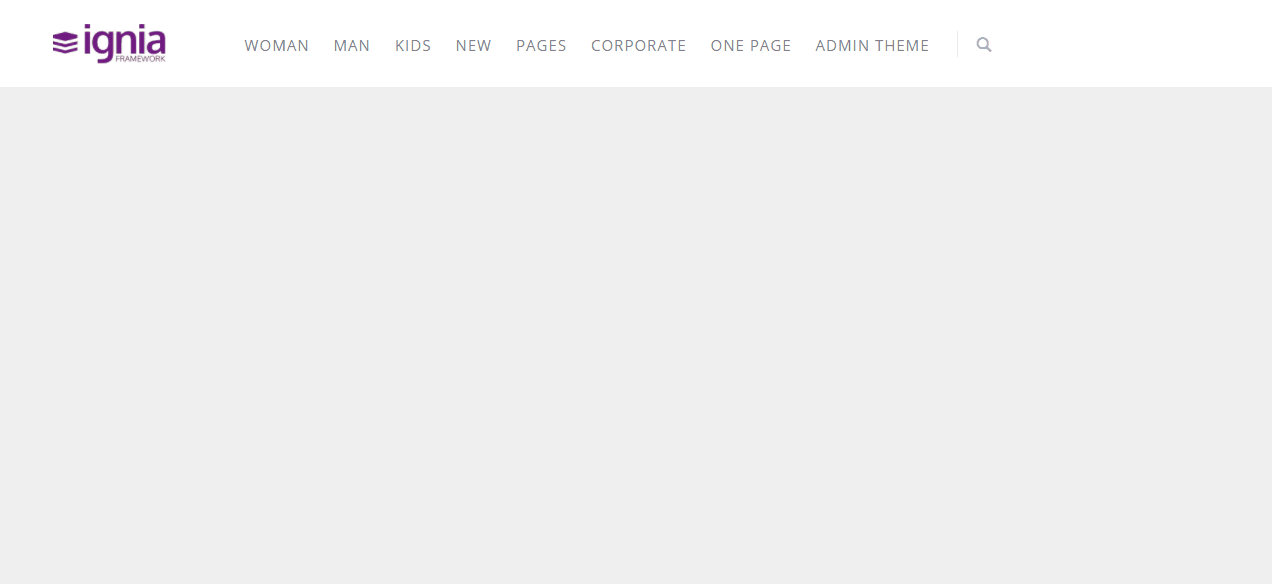
Horizontal responsive menu that can be customized to the maximum, adaptable both for management environments and for e-commerce style end-user sites. It has three types of menu (Classic, Mega Menu and Product Menu).
This User Control is used by the Modda Web Template.
The same screen but seen from a mobile device will be seen:

Platforms
Web
Using the control
Open the Extensibility Catalog and go to the Web section through the left side menu.
Select the AdvancedMenu and then install. (See documentation of Extensibility Catalog if you have questions in the process of installing controls).
During the installation process it is recommended to import the example XPZ that comes with the control.
When importing the example XPZ of the User Control in the Ignia/Controls/AdvancedMenu path an example Web Panel and the SDTs with the data structures for each type of Menu template are created.
Data structure
To load the data of the elements that are to be displayed in the menu, the control has a data structure based on the SDT AdvancedMenu.
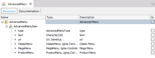
- type: domain enumerated to specify the type of menu of an element. The menu types are: ClassicMenu, MegaMenu, ProductMenu. Each type of menu has its own data structure based on the SDTs of the same name.
- text: text of the menu item.
- url: link of the menu item, to be used in root elements that are of the ClassicMenu type, but do not have children.
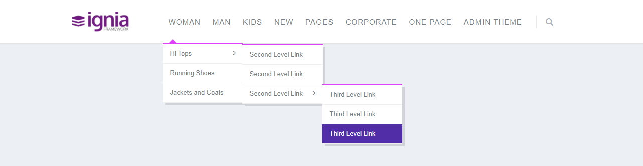
ClassicMenu
The elements of type ClasicMenu within the Advanced Menu allow creating sub-menus in the form of a list, which can be n-levels.
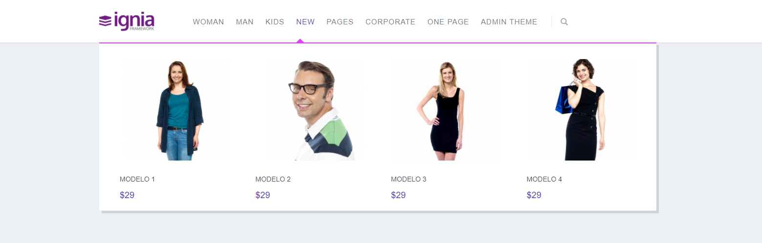
ProductMenu
The ProductMenu type elements within the Advanced Menu allow you to create sub-menus in the form of a list of products with the following appearance:
MegaMenu
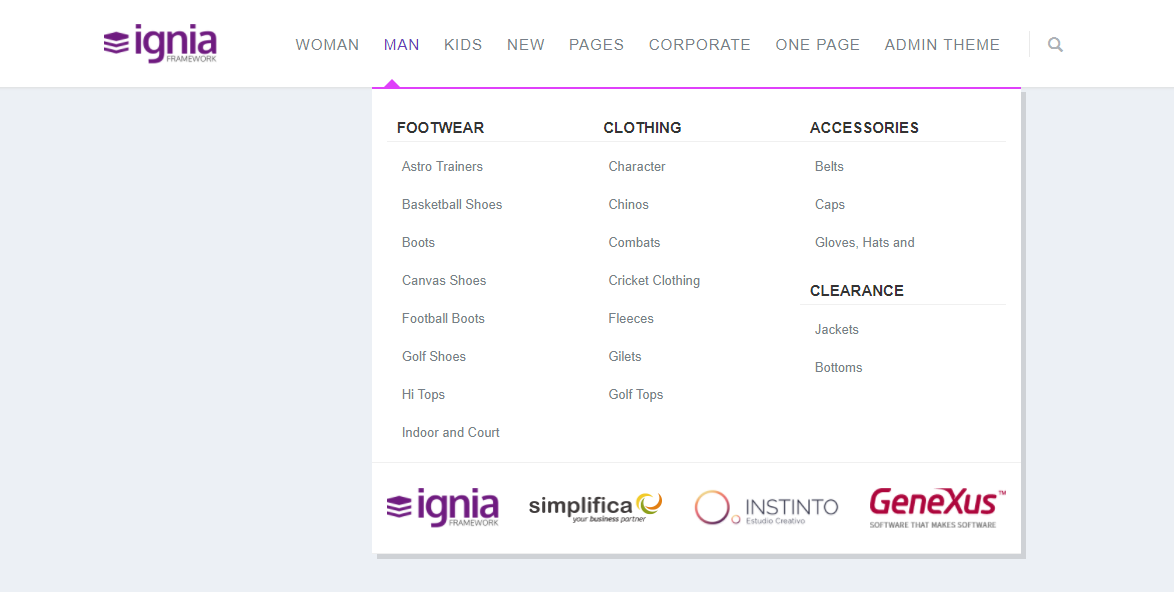
The MegaMenu type elements within the Advanced Menu allow to create submenus with the following appearance:
Properties
- Class: Class associated with the carousel, to see the customizations that can be made, for more details go to the Styles Configuration section.
- Menu Data: SDT con los datos a mostrar en el menú, el tipo de SDT es AdvancedMenu.
- Logo Url: Url where the logo image is located.
- Logo Link: Link associated with the logo.
- Enable Search: Enable the search bar of the menu.
Styles settings
To configure the control styles in the GeneXus themes we find a new type of class called AdvancedMenu.
This type of class can be assigned to the control through the Class property.
The AdvancedMenu class has the following properties:
- Primary Color: Color of the letters and icon of search of the menu when passing the mouse on the item.
- Primary Background Color: Background color from the first level onwards (when hovering over the item / hover).
- Primary Border Color: Color of the lines when hovering over the menu options.
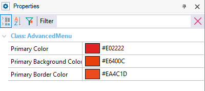
The default values of:
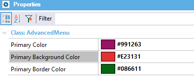
Changing them by:
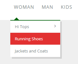
The following changes are obtained in the menu:
Advanced style options
Change the background color of the first level (default: white)
You must create a Custom class in the Theme name "advanced-menu .header" and add in the property "Custom Properties" the value: background: <Color> !important;
Where <Color> corresponds to the Hexa of the color and / or name of the same.
Change the color of the letters of the first level
You must create a Custom class in the Theme name "advanced-menu .header .header-navigation>ul>li>a" and add in the property "Custom Properties" the value: color: <color> !important;
Horizontal responsive menu that can be customized to the maximum, adaptable both for management environments and for e-commerce style end-user sites. It has three types of menu (Classic, Mega Menu and Product Menu).
This User Control is used by the Modda Web Template.
The same screen but seen from a mobile device will be seen:
Platforms
Web
Using the control
Open the Extensibility Catalog and go to the Web section through the left side menu.
Select the AdvancedMenu and then install. (See documentation of Extensibility Catalog if you have questions in the process of installing controls).
During the installation process it is recommended to import the example XPZ that comes with the control.
When importing the example XPZ of the User Control in the Ignia/Controls/AdvancedMenu path an example Web Panel and the SDTs with the data structures for each type of Menu template are created.
Data structure
To load the data of the elements that are to be displayed in the menu, the control has a data structure based on the SDT AdvancedMenu.
- type: domain enumerated to specify the type of menu of an element. The menu types are: ClassicMenu, MegaMenu, ProductMenu. Each type of menu has its own data structure based on the SDTs of the same name.
- text: text of the menu item.
- url: link of the menu item, to be used in root elements that are of the ClassicMenu type, but do not have children.
ClassicMenu
The elements of type ClasicMenu within the Advanced Menu allow creating sub-menus in the form of a list, which can be n-levels.
ProductMenu
The ProductMenu type elements within the Advanced Menu allow you to create sub-menus in the form of a list of products with the following appearance:
MegaMenu
The MegaMenu type elements within the Advanced Menu allow to create submenus with the following appearance:
Properties
- Class: Class associated with the carousel, to see the customizations that can be made, for more details go to the Styles Configuration section.
- Menu Data: SDT con los datos a mostrar en el menú, el tipo de SDT es AdvancedMenu.
- Logo Url: Url where the logo image is located.
- Logo Link: Link associated with the logo.
- Enable Search: Enable the search bar of the menu.
Styles settings
To configure the control styles in the GeneXus themes we find a new type of class called AdvancedMenu.
This type of class can be assigned to the control through the Class property.
The AdvancedMenu class has the following properties:
- Primary Color: Color of the letters and icon of search of the menu when passing the mouse on the item.
- Primary Background Color: Background color from the first level onwards (when hovering over the item / hover).
- Primary Border Color: Color of the lines when hovering over the menu options .
The default values of:
Changing them by:
The following changes are obtained in the menu:
Advanced style options
Change the background color of the first level (default: white)
You must create a Custom class in the Theme name "advanced-menu .header" and add in the property "Custom Properties" the value: background: <Color> !important;
Where <Color> corresponds to the Hexa of the color and / or name of the same.
Change the color of the letters of the first level
You must create a Custom class in the Theme name "advanced-menu .header .header-navigation>ul>li>a" and add in the property "Custom Properties" the value: color: <color> !important;