Description of Control
Control that allows to create a responsive carousel. Based on the Jquery OwlCarousel plugin. It has several types of templates with ready-made designs (Product List, Brand List, Slide, Video List).
Compatibility
Web
Using the control
Open Extensibility Catalog and go to the Web section through the left side menu.
Select the OwlCarousel control and then install.(See documentation of the Extensibility Catalog if you have questions in the process of installing controls).
During the installation process it is recommended to import the example that comes with the control.
When importing it, a sample Web Panel and the SDTs with the data structures for each type of carousel template are created in the Ignia / Controls / Owl path.
Data structure
This User Control has several types of templates and for each one of them a data structure is defined through which the values to be displayed are assigned:
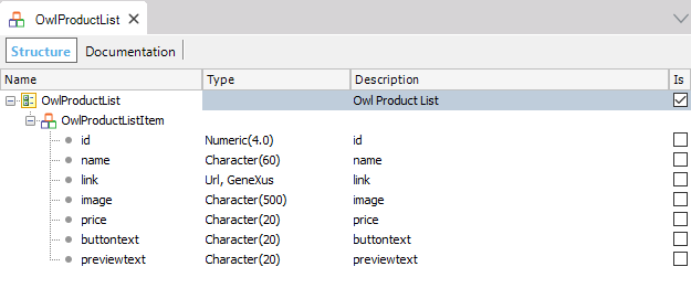
Data structure for a Product List carrousel:
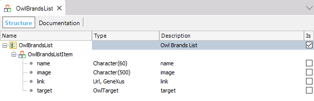
Data structure for a Brand List carrousel:
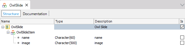
Data structure for a Slide-type carrousel:
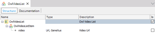
Data structure for a Carousel of the Video List type carrousel:
Properties
- Header: Text to show in the header.
- Center: Center an element.
- Class: Class associated with the carousel, to see the customizations that can be done go to the Styles Configuration
section.
- Animate Out: Class for the output animation. The animations available are all those found in the Animate.css library.Animate.css.
- Animate In: Class for the input animation. The animations available are all those found in the Animate.css library Animate.css.
- Items: The number of items you want to see on the screen.
- Loop: Infinite loop. Duplicate the last and first elements to get an illusion of looping.
- Mouse Drag: Move the elements of the carousel by dragging the mouse.
- Pull Drag: Move carousel elements to the beginning when you drag the mouse.
- Rewind: Go to the first element when the last one is reached.
- Slide By: Amount of elements to scroll when using navigation.
- Start Position: Position of the initial element. Valid for when the Items property is equal to 1. The position of the first item is 0.
- Touch Drag: Enable the movement of the elements of the carousel by touching the screen. For mobile devices and touch screens.
- Nav: Show the paging buttons (previous / next).
- Nav Text Next: Text for the next button.
- Nav Text Prev: Text for the previous button.
- Nav Speed: Navigation speed.
- Dots: Show the page by points.
- Dots Each: Show points every x elements.
- Dots Speed: Paging speed.
- Autoplay: Enable automatic playback of the carousel.
- Autoplay Timeout: Time interval for changing the elements.
- Autoplay Hover Pause: Pause playback when hovering with the mouse.
- Autoplay Speed: Speed of the automatic reproduction.
- Template: Type of design for the carousel to be displayed
.
- Data: SDT with the data to be displayed on the carousel, the type of SDT depends on the selected Template.
- Responsive: Enable the responsive behavior of the carousel.
- Item Extra Small: Number of items to display per page on the carousel at a resolution of less than 768 px.
- Item Small: Number of items to display per page on the carousel in a resolution greater than or equal to 768px and less than 992 px.
- Item Medium: Number of items to display per page on the carousel in a resolution greater than or equal to 992px and less than 1024 px.
- Item Large: Amount of items to display per page on the carousel in a resolution greater than or equal to 1024px.
Styles settings
To configure the control styles in the GeneXus themes we find a new type of class named
OwlCarousel.
This type of class can be assigned to the control through the Class property.
La clase OwlCarousel cuenta con las siguientes propiedades:
- Header Class: Class used for the "Header" of Carousel. (Type of class: TextBlock).
- Container Class: Class used for the Carousel container. (Type of Class: Section).
- Item Container Class: Class used for the container of the carousel elements. (Type of Class: Section).
- Dots
- Dot Class: Class used for the style of the container of the paging points. (Type of Class: Section).
- Dot Active Class: Class used for the style of the active point. (Type of Class: Section).
- Nav
- Nav Class: Clase utilizada para el estilo de los botones del paginado. (Tipo de Clase: Section).
- Nav Prev Class: Clase utilizada para el estilo del botón anterior del paginado. (Tipo de Clase: Section).
- Nav Next Class: Class used for the style of the paging buttons. (Type of Class: Section).
- Template Product List
- Product Name Class: Class used to design the text "Product name". (Type of class: Section).
- Price Class: Class used to design the "Price". (Type of Class: Section).
- Add Cart Button Class: Class used to design the"Add to cart". (Type of class: Button).
- Zoom Button Class: Class used to design the "Zoom". (Type of class: Button).
- View Button Class: Class used to design the "View". (Type of class: Button).
- Template Video List
- Video Wrapper: Class used to design the Video container. (Type of Class: Section).
Execution
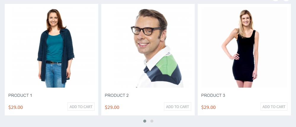
Template Product List
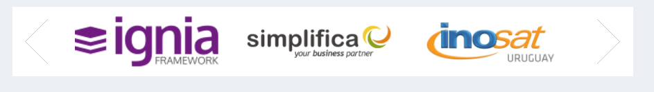
Template Brand List
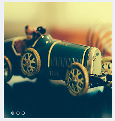
Template Slide
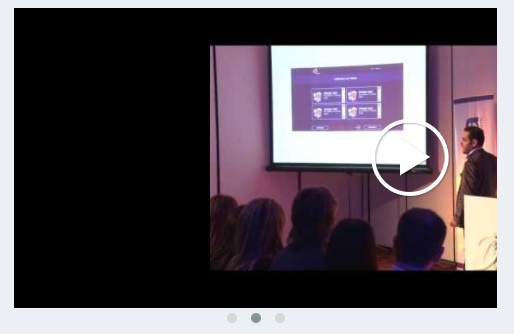
Template Video List