Description
Control that allows to show different types of Widget (Basic Box, Stat Box, Progress Box) with modern and attractive designs.
Compatibility
Web
Installation
Manual Form Installation
To install the Widget manually, you must copy the files related to the control in the path [Installation of GeneXus]\UserControls\ignia\, later you must execute/install in the path of the GeneXus installation.
Widget templates available
The User Control Widget has a property that allows you to define the type Template that will be used to render the data of a Widget.
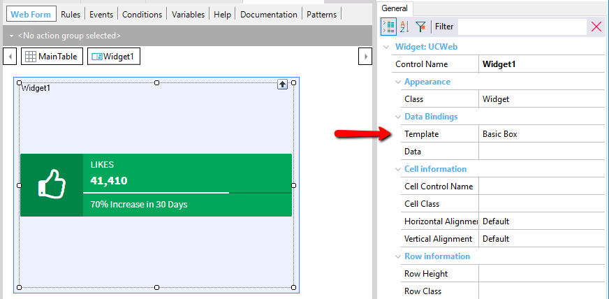
The data to be displayed for each Widget Type is set in the Data property, for each Template Type a specific structure of data is needed that is explained below.
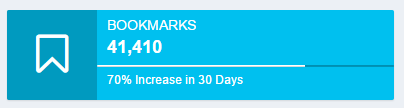
Basic Box Style
The style of Basic Box is the following:

This widget style allows you to define the following information fields:
- Message: Message to be displayed.
- Number: Number or text below
- Icon: icon to show, can be any of those available in Font Awesome http://fontawesome.io/icons/
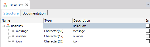
The data structure associated with the style is the following:
Progress Box style
The style of Progress Box is the following:
This widget style allows you to define the following information fields:
- Message: Message to be displayed
- Number: Number or text below
- Icon: Icon to show, can be any of those available in Font Awesome http://fontawesome.io/icons/
- Progress: Numeric value to draw the % progress of the progress bar of the card, it must be a value between 0 to 100.
- Description: Lower text to show under the progress bar.
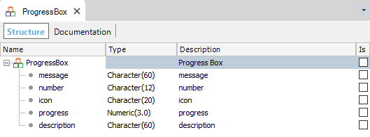
The data structure associated with the style is the following:
Stat Box style
The style of the Stat Box is the following:
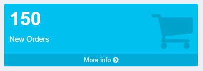
This widget style allows you to define the following information fields:
- Message: Message to be displayed
- NumberIcon: Number of superior text.
- More Info Text:Text to show in the link to display more information.
- Link: Link to which the user is redirected to show more information.
- Target: Specify where you want the More Info text link to open.
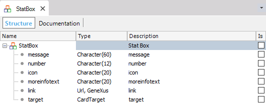
The data structure associated with the style is the following:
Example Xpz
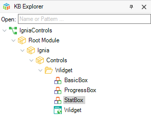
When importing the example xpz of the User Control Widget in the Ignia/Controls/Widget path, an example Web Panel with several widgets and the SDTs with the data structure for each type of widget are created.
Configuration of styles
The style of widgets components can be defined from the GeneXus theme that is being used in the KB. For this, each widget can be assigned a class through the Class property .
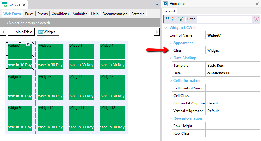
The type of possible class to add to this property is of type Widget and you can use one of the ones that comes by default when installing the User Control or create your own in the theme.
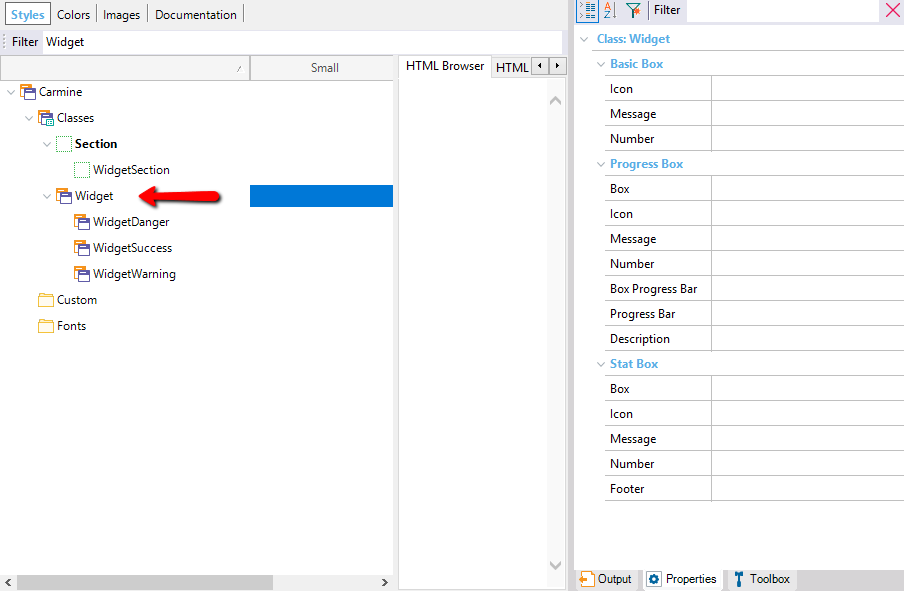
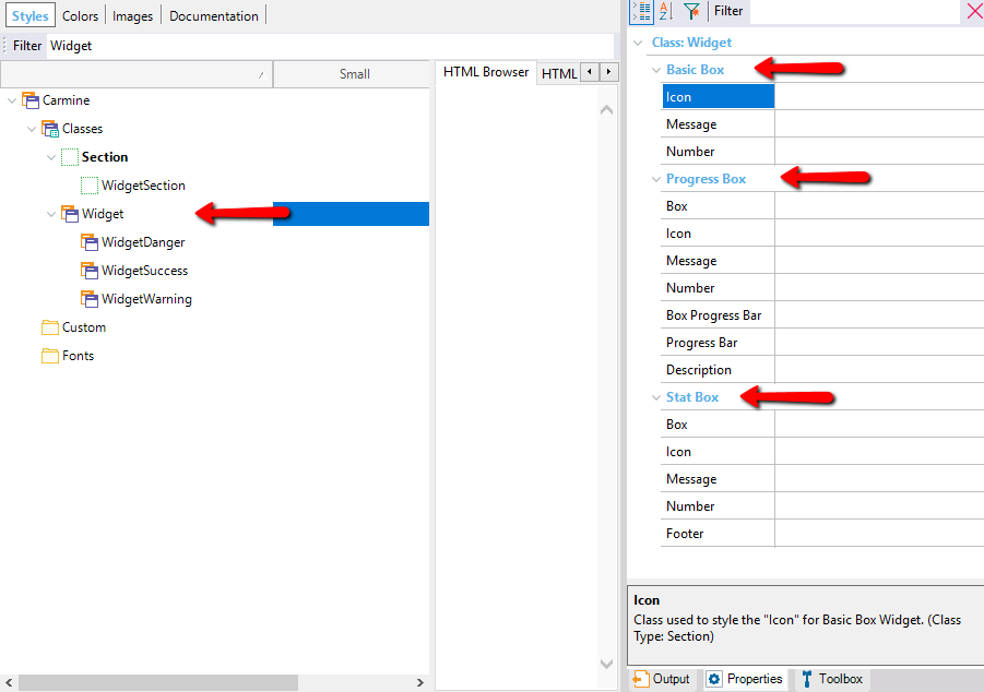
Widget type classes have properties to customize each of the components. Each property are classes of a type in the theme that can be created to customize a part of a widget.
In turn, the properties are grouped and specified for each type of Widget.
Example of customization
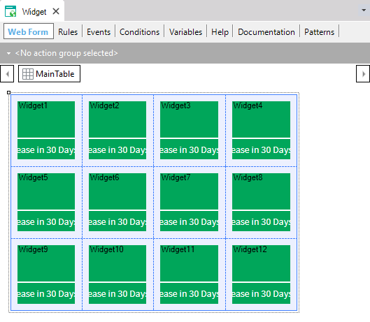
The Sample Web Panel that is imported with the User Controls, when viewed for the first time, is displayed as follows:
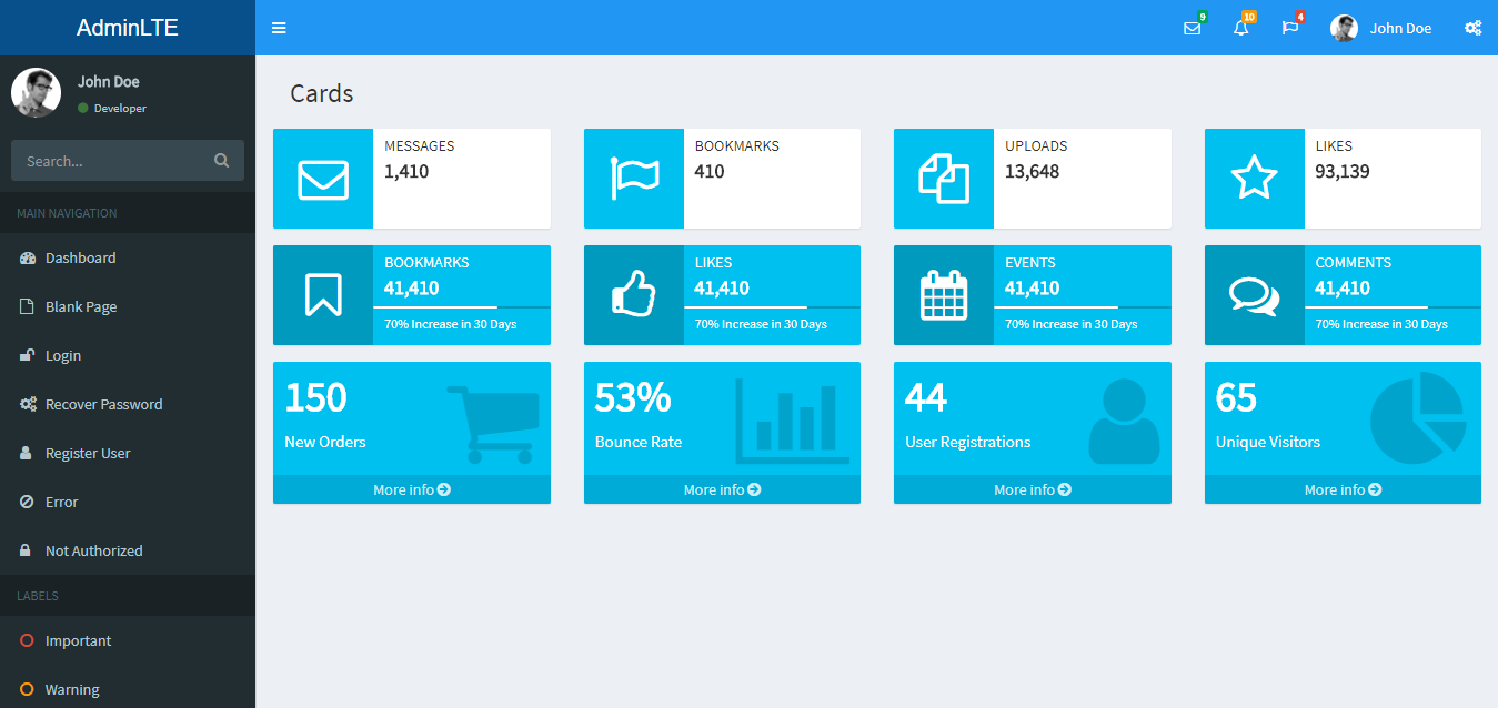
All the widgets are shown with the same colors, if the imported classes of example are modified in the theme, you can see how the appearance of the widgets changes. For this in the subject make the following modifications.
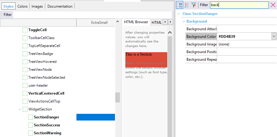
- Under the WidgetSection class assign a Background Color to the subclasses: SectionDanger, SectionSuccess, SectionWarning.
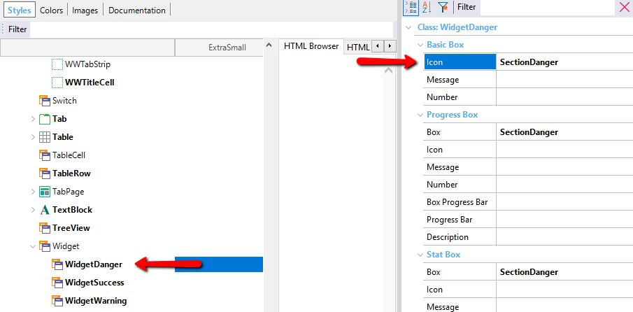
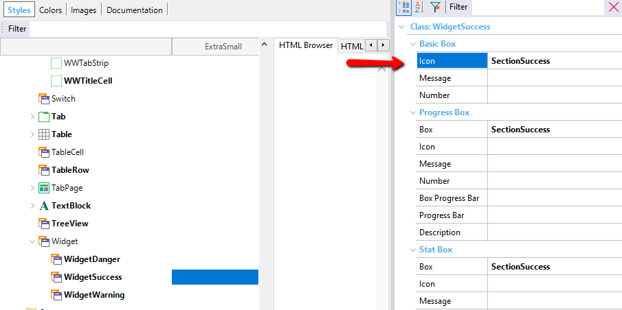
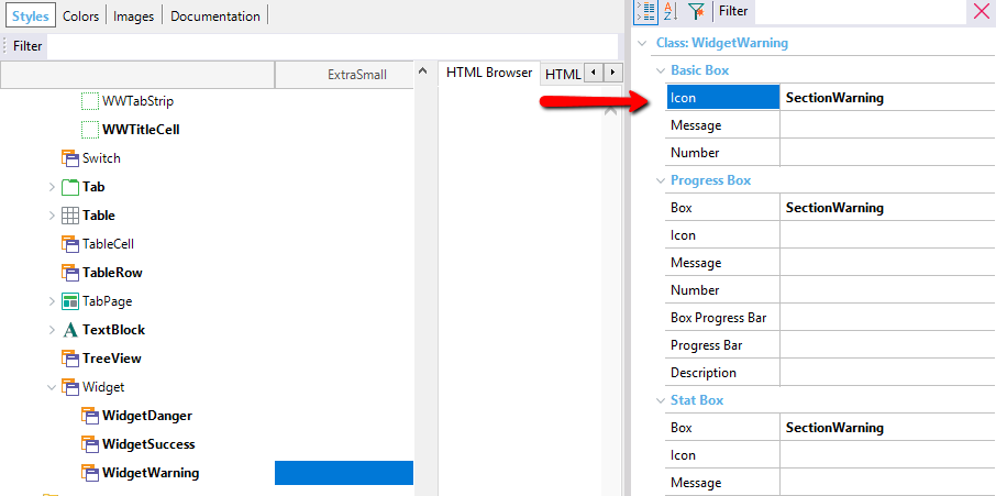
- To the classes WidgetDanger, WidgetSuccess, WidgetWarning, which are under the Widget class assign the previously modified classes in the following way:
After making these changes, run GeneXus again to see the changes:
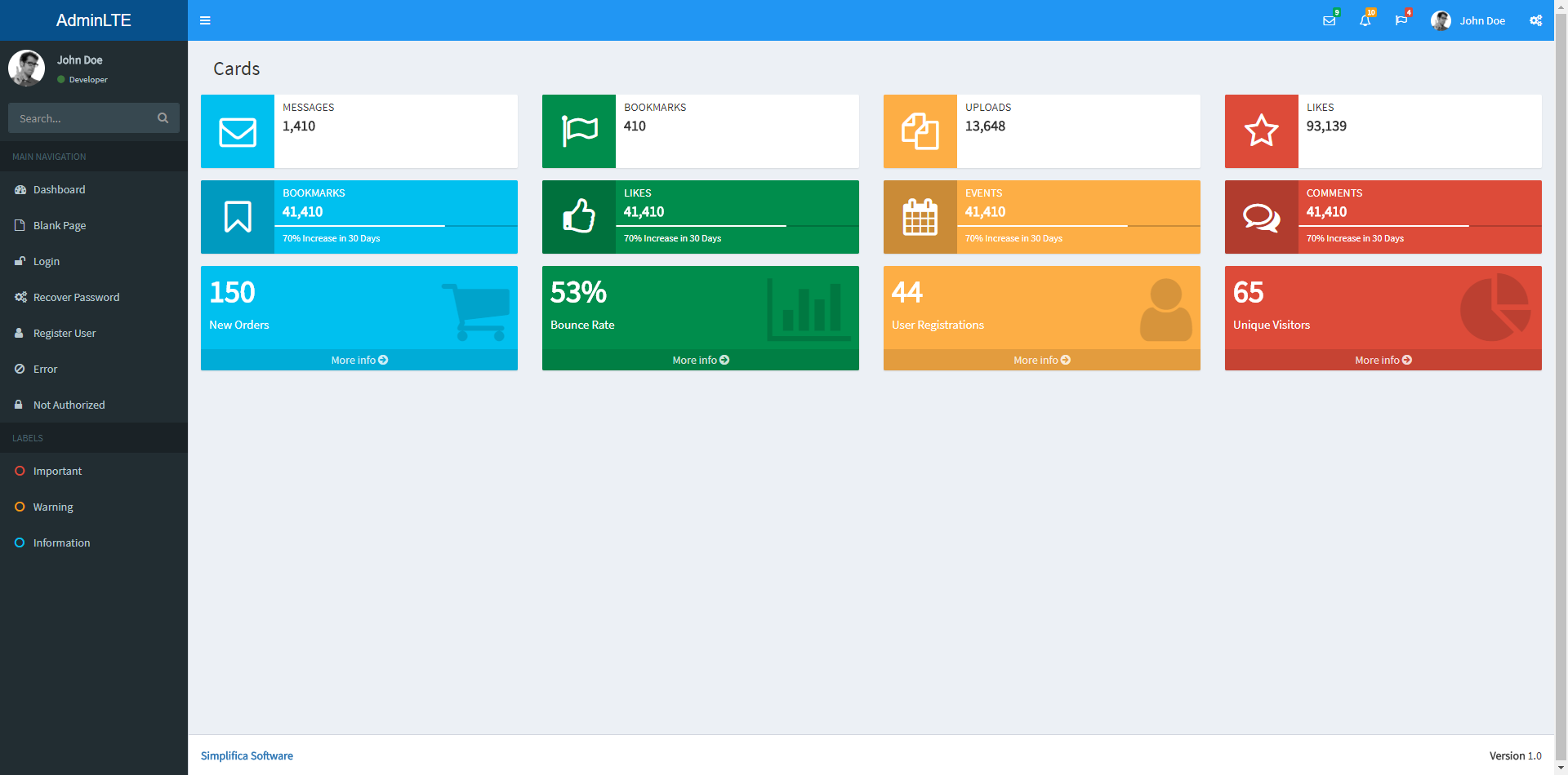
In this case several styles of widgets are shown, this is because in the Web Panel example each widget already comes with an assigned class that can be WidgetDanger, WidgetSuccess, WidgetWarning, which are the classes that were previously modified. In the same way you can modify the styles of each of the components of each widget.